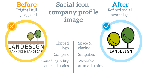
Social Icon Assist
It may not be immediately apparent onscreen to the changes and improvements, so we have listed them with before and after features in each of the asset areas.
Ask yourself…
Clarity
How well is your company represented on social media?
The logo or brand mark of the company should be used as the social profile image as it instills a sense of recognition and connection with the viewer.
Social media platforms are great for communicating and getting your brand out there. However, all too often you see a company logo used as the main profile image, which is either difficult to identify or is even illegible to the viewer. This is often made worse by a multitude of image sizes and shapes that the social media platforms use to display the profile image. Not only can they be shown at extremely small sizes, be either square or circular in shape, but they also have to work across a wide range of resolutions for mobile devices, tablets and desktops.
Social media is quickly becoming an overcrowded marketplace, which is exacerbated by its very nature. The rapid interaction and constant updates of post and advertising limits the time frame for capturing viewers attention. It is imperative therefore, that your profile image represent your company in its best light. For this reason the Beyond the Scale ‘Social Icon’ service offers a solution to convert logos so that they work better in the digital media arena.
Confusion
Is your logo too complicated for use on social media?
Social media is a fairly recent development and a lot of logos designs and especially older ones which were created before the digital era do not engage with it as well as they perhaps could. Logos vary wildly in their complexity and proportions, some are purely visual whilst others are typographic. Because of this not all logos fit well as they stand into social media framework.
To resolve this Beyond the Scale create a media friendly adaptation of your existing logo/symbol/emblem for use on social media platforms, app icons and website shortcut icons. This is not a full logo redesign, but a reflection and simplification suitable for the format.

![]()
![]()
![]()
![]()
